Choosing the right fabrics is one of the most important decisions you make as a quilter. The fabric you select affects how your quilt feels, how long it lasts, how well it holds its shape, and how beautifully the colors and patterns come together. With so many fabric types, weaves, and qualities available, it can feel overwhelming for beginners. But with a bit of understanding and guidance, selecting quilting fabrics becomes an enjoyable part of the creative process. This guide will help you choose the best fabrics for quilting—whether you prefer traditional designs, modern aesthetics, or a handcrafted style inspired by mixed-media pieces like the one in your uploaded reference image (/mnt/data/0-mage-D_1954037093907599-1.jpg).
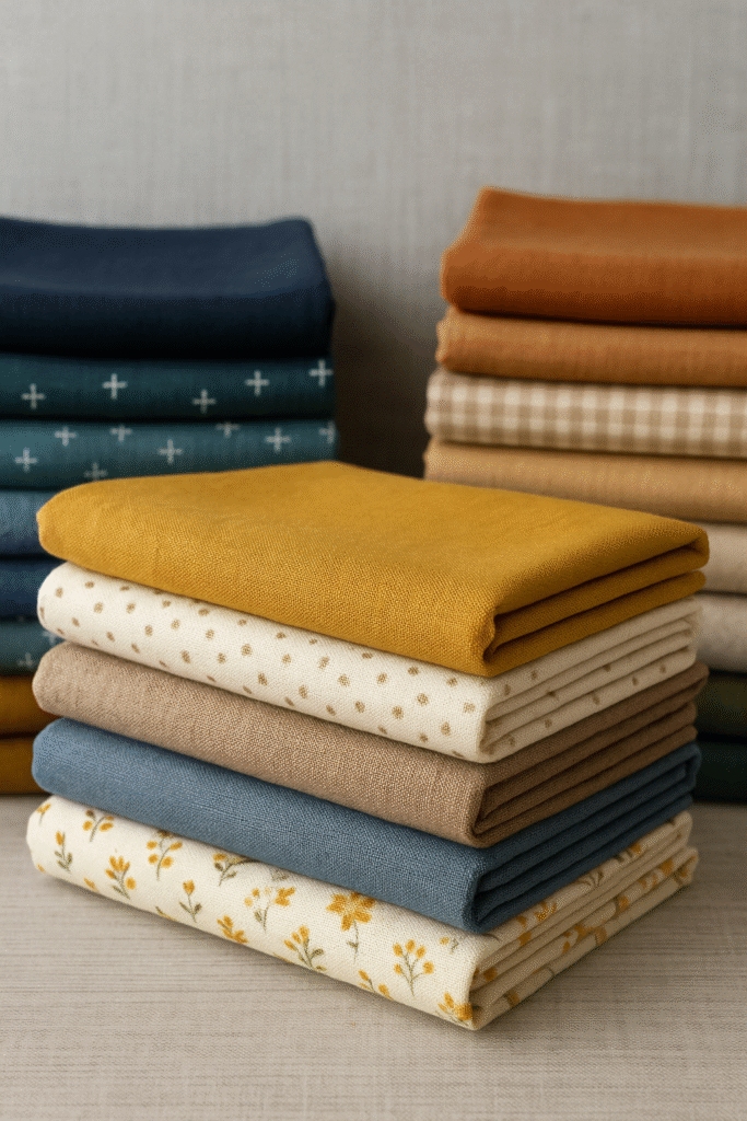
The fabric in your projects contributes not only to durability but also to personality. The textures, colors, and tones shown in your reference image suggest a handcrafted, warm, artisan-inspired quilting style, which is becoming increasingly popular in modern quilting and crochet-hybrid projects. Keeping that aesthetic in mind, let’s dive into how to choose quilting fabrics effectively.
Understanding Quilting Cotton
Quilting cotton is the most common fabric used in quilting. It is durable, easy to sew, breathable, and available in thousands of prints and colors. High-quality quilting cotton has a tight weave that prevents stretching and fraying. This tight weave also helps blocks hold their shape during piecing. When shopping for cotton, look for fabrics labeled “premium quilting cotton.” Lower-quality cotton may feel stiff, scratchy, or thin and can distort the structure of your quilt over time. Cotton is ideal for both traditional quilt patterns and modern, textured designs inspired by handmade aesthetics.
Pre-Washing Fabrics
Pre-washing is a personal choice, but many quilters recommend it, especially for bright, saturated fabrics. Pre-washing prevents unwanted shrinkage later and helps remove excess dye. If your project includes multiple light and dark fabrics—like the contrast seen in your reference image—pre-washing reduces the risk of bleeding. Some quilters prefer not to pre-wash because sizing (a factory finish) helps fabrics stay crisp during cutting. Both methods work, as long as you stay consistent within a project.
Checking Fabric Quality
To ensure you’re working with good fabric, hold it up to the light. High-quality quilting cotton should not appear overly transparent. Pull gently on the edges—fabric that stretches easily may warp during sewing. The fabric should feel smooth but substantial, without a plastic or overly stiff feel. Quality matters more than quantity; investing in good fabrics ensures that your quilt lasts for generations.
Choosing Fabrics That Match Your Design Style
Your reference image reflects a handmade, cozy aesthetic with a strong tactile feel. Choosing fabrics that match this style helps bring the same personality into your quilts. For example:
Natural tones (cream, beige, soft brown) pair well with textured crochet accents.
Soft pastels enhance delicate, artisan-inspired quilt blocks.
Rich, warm colors create depth and complement handcrafted motifs.
Modern quilters might choose large-scale prints or solids with minimal texture.
Traditional quilters often prefer classic calicos, florals, and reproduction fabrics.
Let your fabrics tell a visual story—just like traditional quilts do.
Solids vs. Prints
Solids are essential in modern quilts because they help define shapes and enhance geometric designs. Solids are also useful in quilt-crochet hybrid projects, where texture already plays a big role. Prints add personality, detail, and variety. Small prints work well in intricate blocks, while large prints make bold statements. When combining prints, vary their scale to prevent your quilt from feeling too busy. A balanced mix of solids and prints creates harmony and structure.
Understanding Value and Contrast
Value refers to the lightness or darkness of a fabric. High contrast—such as pairing light cream with deep navy or charcoal—makes shapes stand out clearly. This kind of contrast is often used in geometric quilts and modern layouts. Medium values help soften transitions, while low-contrast fabrics create subtle, blended effects. Your reference image suggests strong visual impact from color and texture contrast, making value an important tool for achieving cohesive, modern designs.
Batiks for Vibrant Quilts
Batiks are hand-dyed fabrics known for their rich colors and organic patterns. They are perfect for artistic quilts that mimic the style of handcrafted crochet-quilt combinations. Batiks have a tight weave, making them ideal for sharp points and detailed blocks. Their natural, earthy aesthetic pairs beautifully with rustic or boho-inspired designs.
Specialty Fabrics for Texture
If you enjoy the look of texture—like the blended yarn-and-fabric appeal in your reference image—you may consider adding specialty fabrics to your quilts. These include:
Linen blends for natural texture
Homespun fabrics for soft, vintage charm
Flannel for cozy, warm quilts
Wovens for rustic, farmhouse-style patterns
Specialty fabrics must be handled carefully because some fray more easily or stretch. Test a small piece before committing.
Using Precuts for Convenience
Precuts—like charm packs, jelly rolls, and fat quarters—are bundles of coordinating fabrics already cut into convenient sizes. They save time and make color matching easier. Precuts are perfect for beginners or for quilters who want a cohesive look without selecting every fabric individually. Many modern designers offer precut collections with color palettes that mimic artisan, nature-inspired styles similar to your reference image.
Choosing Background Fabrics
The background fabric sets the tone for the entire quilt. White and cream create a clean, bright foundation. Gray and beige offer a modern, soft look that enhances warm or natural palettes. Black provides drama and bold contrast. When choosing a background, consider how it interacts with your other fabrics. Background fabric should support your design—not overpower it.
Coordinating Colors
Color coordination is easier when following color theory basics:
Analogous colors (blues, teals, greens) create harmony.
Complementary colors (yellow and purple, blue and orange) add bold energy.
Monochromatic palettes create elegance and calmness.
Your reference image suggests a palette inspired by handcrafted textures and organic tones—making warm neutrals, muted pastels, and earthy shades excellent choices.
Fabric Care and Longevity
The best quilting fabrics are durable and easy to care for. Cotton remains the top choice because it washes well and lasts for years. For baby quilts, washable cotton or flannel is best. For display quilts, you may choose more delicate fabrics. Always check fiber content and washing instructions when choosing cloth.
Sustainability and Ethical Fabric Choices
Quilters increasingly look for sustainable options such as organic cotton, recycled fabrics, and naturally dyed textiles. These materials pair well with slow-craft, handmade styles—like crochet-and-quilt hybrid pieces inspired by your reference image—making your quilt not only beautiful but also environmentally conscious.
Trusting Your Eye and Creativity
Choosing fabrics is part science, part intuition. Lay your fabrics out together. Step back and look at them as a whole. If the colors, values, and textures feel balanced and inspiring, you’ve found the right combination. The more quilts you make, the more confident you’ll become.