Color is one of the most important elements in quilt design. It influences the mood, the style, and the overall visual impact of your quilt. Even simple patterns become stunning when the colors are thoughtfully selected, while complex patterns can fall flat if the colors don’t work well together. Choosing the perfect color combinations can feel intimidating, especially for beginners, but it doesn’t have to be overwhelming. With a little knowledge and experimentation, you can create beautiful color palettes that make your quilts come alive. This guide will help you understand color basics, build harmonious palettes, and select fabrics with confidence.
Understanding Basic Color Theory
Before diving into quilt-specific techniques, it’s helpful to understand basic color theory. The color wheel is a simple but powerful tool that shows the relationship between colors. There are three categories of colors: primary (red, blue, yellow), secondary (green, orange, purple), and tertiary (colors made from mixing primary and secondary hues). Colors opposite each other on the wheel are complementary, while colors next to each other are analogous. Complementary colors create contrast and energy, while analogous colors create harmony and calmness. Understanding these relationships will help you decide whether you want your quilt to feel bold, soft, modern, or traditional.
Choosing a Mood for Your Quilt
Every quilt has a personality, and color is the fastest way to express that personality. Before selecting fabrics, consider what mood you want your quilt to convey. Soft pastel tones create gentle and soothing quilts. Bright, saturated colors create cheerful, lively pieces. Earth tones give a warm and natural feeling, while cool blues and greens create a calming effect. Neutral palettes, such as whites, grays, taupes, and creams, give quilts a modern, sophisticated look. When you choose a mood first, it becomes much easier to narrow down your color options and create a consistent palette.
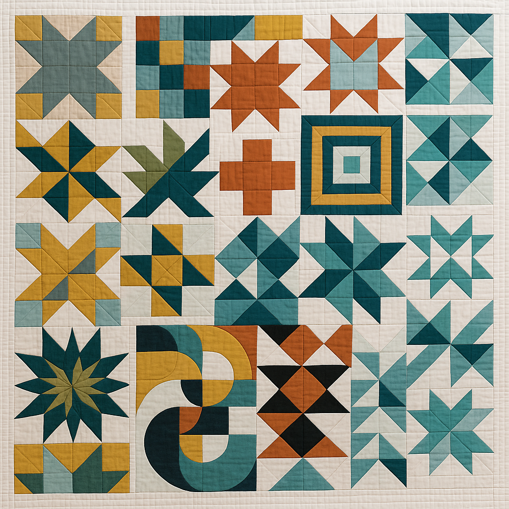
Working With Monochromatic Palettes
A monochromatic palette uses different shades, tints, and tones of a single color. This approach is perfect for beginners because it offers cohesive results with minimal risk of clashing colors. Even though the palette focuses on one color, the use of light, medium, and dark values adds depth and interest. For instance, a blue monochromatic quilt might include navy, sky blue, teal, and pale blue. These quilts are visually pleasing, easy to design, and suitable for modern or minimalist styles. Monochromatic palettes are a great starting point if you struggle with combining multiple colors.
Using Complementary Color Schemes
Complementary colors sit opposite each other on the color wheel, such as blue and orange, red and green, or purple and yellow. When used together, they create high contrast and dynamic visual interest. Complementary color schemes are perfect for bold, vibrant quilts that make a strong statement. To keep the design harmonious, choose one color as the dominant tone and use the complementary color as an accent. For example, a mostly blue quilt with small pops of orange feels energetic without becoming overwhelming. Balancing dominance and accent is the key to a successful complementary palette.
Exploring Analogous Color Palettes
Analogous palettes use colors that sit next to each other on the color wheel, such as blue, teal, and green or yellow, orange, and red. These palettes feel natural and harmonious because the colors blend well together. Analogous quilts are especially effective for creating soft transitions and organic movement. This style works well for gradient quilts, landscape-inspired quilts, and modern designs with flowing lines. For added depth, include a mix of light, medium, and dark values within your analogous palette. This keeps the quilt visually interesting while maintaining cohesion.
Playing With High Contrast vs Low Contrast
Value—meaning how light or dark a color is—is just as important as the color itself. High-contrast quilts use a strong difference between light and dark tones, creating bold designs that emphasize shapes and patterns. Low-contrast quilts use colors that are closer in value, resulting in softer, more subtle quilts. The pattern you choose determines which contrast level works best. Geometric or graphic patterns often benefit from high contrast, while traditional or delicate patterns may look better with low contrast. Always consider value differences when selecting fabrics; even beautiful colors can blend together if they don’t have enough contrast.
Using Neutrals Effectively
Neutrals like white, black, gray, beige, and cream play a vital role in balancing color within quilts. Neutrals help your main colors stand out and prevent the design from becoming too busy. White creates a crisp, bright look; black adds drama and sophistication; gray offers a modern feel; and beige brings warmth. You can use neutrals as background fabrics, borders, sashing, or even as part of the main block design. Mixing neutrals with bright or saturated colors is a foolproof strategy for creating clean, modern quilts.
Drawing Inspiration From Nature
Nature provides some of the most beautiful and reliable color combinations. From the soft tones of a sandy beach to the vibrant hues of a flower garden, natural color palettes feel balanced and timeless. Look at sunsets, forests, fields, oceans, or even individual plants for inspiration. For example, a forest-themed palette might include deep greens, bark browns, mossy yellows, and soft neutrals. A beach-inspired palette might include aqua, turquoise, tan, and cream. Using nature as a guide helps you create quilts that feel harmonious and grounded.
Using Fabric Collections for Easy Coordination
If choosing colors still feels overwhelming, fabric collections are an excellent solution. Designers curate collections with colors and prints that already coordinate beautifully. You can purchase pre-cut bundles or yardage from a single collection, ensuring the colors work well together without needing to plan each detail. Fabric collections are especially helpful for beginners who want professional-looking results with less stress. Even experienced quilters use collections when they want quick, cohesive color planning.
Auditioning Fabrics Before You Sew
Before committing to a palette, it’s important to audition your fabrics. Lay them out together on a flat surface and examine how the colors interact. Try viewing them in natural daylight, as artificial lighting can distort true colors. Look at the fabric arrangement from a distance to see if any color stands out too much or feels out of place. Consider taking a photo and converting it to grayscale; this reveals value differences and shows whether your palette has enough contrast. Auditioning fabrics helps you avoid unpleasant surprises once you start piecing your quilt.
Balancing Prints and Solids
Color selection also involves choosing the right mix of solids and prints. Solids create clarity, structure, and modern appeal, while prints add texture, personality, and charm. Too many prints can make the quilt feel chaotic, while too many solids can make it feel flat. Aim for a balanced combination. Use solids to define shapes and patterns, and use prints to soften the composition or add visual interest. Keep the scale of prints in mind as well; mixing large, medium, and small prints helps maintain variety without overpowering the design.
Trusting Your Personal Style
While color theory provides valuable guidance, your personal style should always lead the way. Quilting is a creative expression, and the colors you choose should feel meaningful and enjoyable to you. If certain colors make you happy, find ways to incorporate them into your quilts. If you prefer calm tones, lean toward gentle palettes. If you love bold and vibrant designs, embrace high-contrast schemes. Over time, you’ll discover your unique color signature that reflects your taste and creativity.
Practice Makes Perfect
Choosing color combinations becomes easier with experience. The more quilts you make, the more confident you will become in selecting colors. Don’t be afraid to experiment, try unexpected combinations, or make mistakes along the way. Each quilt teaches you something new about how colors interact and how to create visual harmony. With time, you’ll develop an intuitive sense for selecting palettes that suit your artistic vision beautifully.